What is a call to action?
A Call to Action (CTA) is where you tell visitors about the action you want them to take after viewing your Internet, Blog, or social media content. A successful CTA depends on the CTA content, placement, and design.
If you don’t have an enticing offer for visitors to act, they go. If your call-to-action doesn’t stand out or is visually dull, your audience may scroll right past it. You can improve all conversions regardless of your business industry and model by using these simple tips.
Use Action Words
Your storytelling goal should be for visitors to act. So, it’s no surprise that you need to use action verbs such as, Download, Activate, Unlock, Try for Free, Join, Start, or Begin Your Adventure.
Provide Instant Gratification
It’s wise to use instant gratification in the setup copy. For example, OptinMonster has a powerful copy that states; “1,213,437+ websites are using OptinMonster to turn their traffic into subscribers”. OptinMonster is a cost-effective lead generation software for marketing agencies, bloggers, eCommerce website developers, and small businesses.
Create Urgency
Urgency is created by including words such as “For the Next 7 Days Only” “Now” and “Today” “Install Now”, “Instant Download for Free Survey”. Where applicable, you can also add countdown timers and stock counts. These are more likely to convert your online visitors to sales prospects.
Make It Irresistible
When an ideal prospect lands on your website, it’s your job to present them with an offer that is so appealing that it’s accepted. For example, $200 off a big-ticket item, a 30-day free trial guarantee or free survey in return for the prospects email are all appealing offers for online users.
Use Colours
The colour of your CTA matters. Green and orange buttons are reported to perform best but colours depend on your site design. Add contrasting colours so that the CTA stands out. Different colours elicit different emotions. For example, Orange elicits playful, energetic, and affordable adds excitement to a site without severity. Check out the impact of colour on emotions in the Creative Blog
Add Flashy Button Shapes
Button shape can also play a big role when attempting to craft the perfect CTA button. Use standard button shapes to visitor attention. Standard shapes include rounded corners, square corners, pill shaped, ghost button or shadowed button. For more information on buttons and button programming click here Litmus.
In some cases, small arrows or graphics on your CTA button can positively affect click-through-rates. Your CTA buttons should always have a large area of white space surrounding them. White space focuses user attention to your button and helps it stand out.
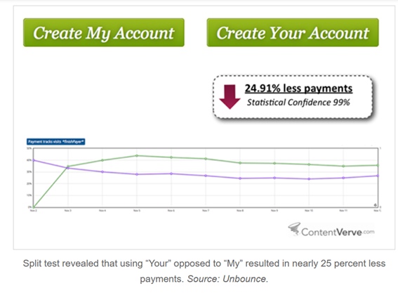
Go With 1st Person Speech
Practical Commerce shared that changing button text from the second person “get your free template” to the first person “get my free template” resulted in upon to 90% increase in clicks. Calls to action written in first-person— “me,” “my,” “I”— result in higher conversions. This is because people react more positively when they are the ones in control.
Cart Calls to Action
E-commerce sites will want to spend the most time testing their cart buttons. Even small adjustments to the cart buttons can affect conversion rates. Be sure to offer buttons for a variety of payment options including PayPal. Including a PayPal button can be an incentive because it is deemed to be safe and is ideal for visitors who are too reluctant or lazy to use their credit cards.
Follow the Natural User Flow
In Western countries, we read top to down and left to right. Hence CTA buttons placed at the bottom or to the right of content often outperforms alternative placements. Avoid forcing users to backtrack in order to click the CTA buttons. For example, you would want users to “Download the 2022 SEO Survey” place the CTA button in a spot where a user would find it after reading about this offer!
More Information
Maria Charlton
maria@mapmarketing.com.au